- date
- 05-2024
- tags
- #design-system

Intro
This month, I prepared a presentation for Ansin Lau and his team about my experience building the design system at Tinka.
He mentioned that his team faced the challenge of having to build a design system and potentially maintain multiple UI libraries, as their users (a.k.a. product teams) might want to experiment with different tech stack while achieving consistency over user experience.
I have roughly the same challenge at Tinka and immediately was up for sharing my experience. It's not really about how we managed to built the perfect solution, but more about how we found a solution with acceptable tradeoffs. "I did all these and survived!" will be the main message of this article.
After the talk, one listener mentioned that it was nice to see how someone actually went through implementing all those things. It was such a lovely feedback that I decided to put this experience out there, hoping it could help someone in the future.
Define framework-agnostic design system
Framework-agnostic design system is an ideal that allow us to design & implement once to target multiple platforms.
We want to help our designers ship designs with confidence that developers won't come back telling them the design takes much more time than they'll ever expect. We want to do so by not only shipping components in Figma but as code to the product teams. However, we don't want to be swamped by having to support all the possible frameworks out there.
In our case, our product teams are mainly using React, but some are using Svelte for their specific needs. The app team is using Flutter. Our designers will use the same set of components, and expect them to have UX consistency across all Tinka's offerings.
The Challenge
Tinka is a medium-sized FinTech company that got separated from an e-commerce company called Wehkamp in 2021.
We build new projects with new websites and new apps all the time while having one design team responsible for all the design. In total, we have 4 designers (including myself), and 1 developer (me) focused on UI/UX.
Our product teams use all kinds of technologies – React, Svelte, some Python site generator for making documentation website. The app team uses Flutter for our cross-platform mobile app. Our product teams also don't have the time to implement the UI components again! As we just rebranded in 2021.
Not only internal teams, our brand and UI elements will be used by third-party merchants. While we cannot forsee what setup they will have, they are also important users of the design system.
The Hypotheses
Documentation-driven design system could save us
Similar to the idea of test-driven development, being documentation-driven encourages me to think about how I communicate my API and design. It automatically put me in the mode of finding an efficient way to help a large user base.
A good documentation might be able to help me create a common language between designer users and developer users. Having something that is implemented, explained in a relevant context, and with usable code snippets could help both side understand the reason and the feasibility of a piece of design.
Make libraries with lots of CSS, a little bit of Javascript, and barely any HTML.
Knowing that each framework handles DOM tree manipulation and state control differently, it might be a good idea that we leave the HTML part to each developer to reimplement while providing them comprehensive support on appearance from one official library.
It is comparable to the idea of design token, where the methodology imagine implementation like this:
import tokens from "design-system";

const aThing = <Thing
  background={tokens.thing.backgroundColor.active}
  textColor={tokens.thing.foregroundColor.active}
/>
In our framework-agnostic design system, we would like to provide a user experience like this:
<tag class="component component-state component-modifier">
The above will make a tag looks like a simple component. Appearance associated with state or variants can be added on top of the base class.
For components with customized behavior, we imagine a workflow for our developers like this:
import { getComponentStyle } from "design-system";

const setOfClasses = getComponentStyle( props, states )

const result = (<tag class={setOfClasses.container}>
  <tag class={setOfClasses.someInnerThing1}></tag>
  <tag class={setOfClasses.someInnerThing2}></tag>
</tag>)
getComponentStyle is a pure JS function that should be compatible with all the frameworks, in other words, framework-agnostic.
The developer needs to go to the documentation and learn the HTML structure of the component, and feed the output of the function into the correct places.
This concept looks like there will be a lot of inconveniences, but it also provides some advantages that we will discuss in the next section, along with the measures we took to control the damage from the disadvantages of this approach.
The Implementation
The base package with TailwindCSS
The core base styling package is built with TailwindCSS. I feel like TailwindCSS is the cheat code to making the base tokens available as utility classes, more than everyone will ever need. Thanks to Tailwind's excellent documentation, I don't have to document all these selectors myself.
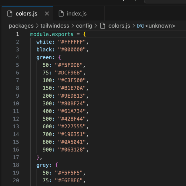
Encode base design tokens into tailwind config file. You can write a script that does this programmatically in the console even before Figma’s Variables. 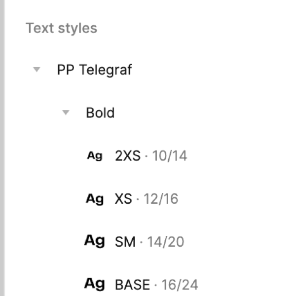
Make sure the tokens available in the code is also present in Figma. It might look excessive but it is important to keep both side mirrored. 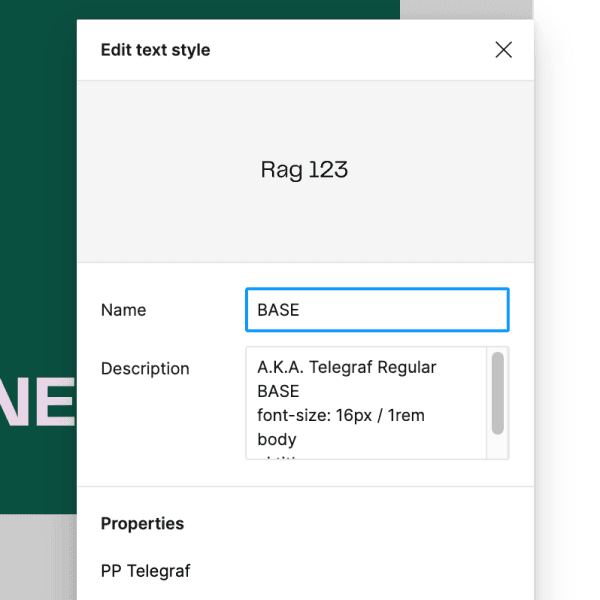
Add the keywords to the description so the designers can find them by typing keywords like "body"
You might wonder what if a user that uses a base token in a situation that is forbidden in the design system. In my opinion, the best way to avoid this is through close collaboration and active communication. This leads to our next point:
Documentation as the key communication tool
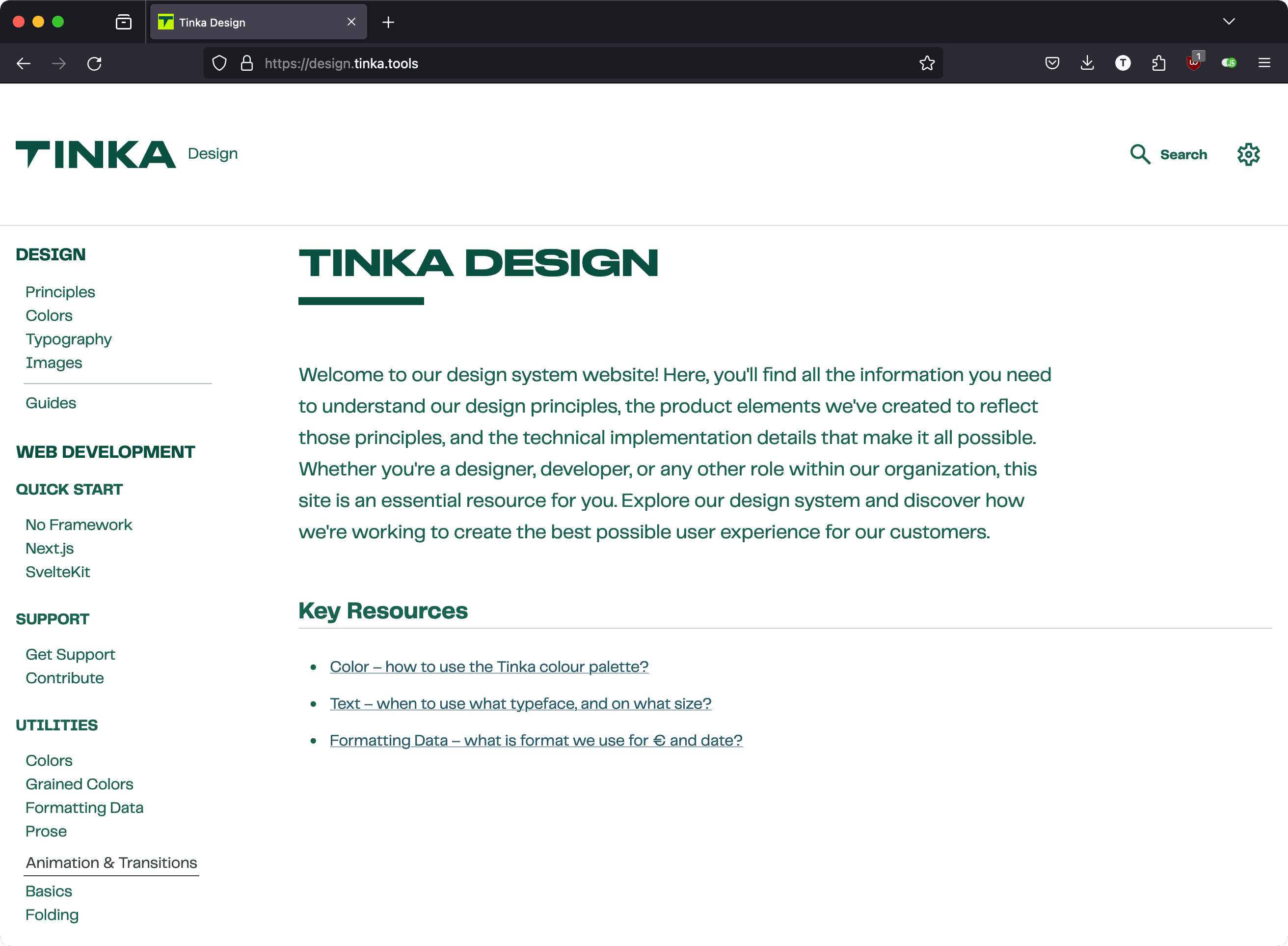
Since the documentation is one of the most important link in the whole project. We decided to make it public and develop all our components within it. It is like a Storybook – but we invested in building it in Next.js to ensure that we are not limited by what Storybook can convey.
While building the documentation site, a first-party React library can be made and release as a separated package that depends on the primary package.
Since our other developers don't get ready-made DOM structure from us, the documentation must be super clear and easy to read.
Office hour
I learned this method from a past talk at Figma's Config.
Every Tuesday morning we have a 45-minute long session with all our designers and developers. There I present the latest additions to the design system. The designers present how they are using the components and what enhancements could be planned. The developers come with suggestions and feedback on the docs. If we need more time, my Slack is always open and I prioritize meetings requests from my design system users.
This has proven to be super constructive for me. We managed to naturally form a usage guideline for our base colors and typography tokens without me excruciatingly identifying the need and naming them. Developers came with all kinds of interesting use cases and ask for documentation around it, such as "Loading state on the button", which is obvious now, but I did miss it in the first few iterations.
Example: Simpler components – our buttons
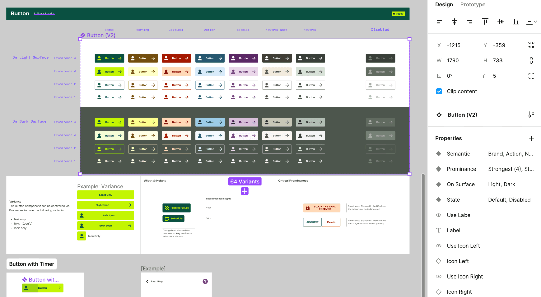
Our buttons are pretty basic, and can be entirely described in CSS. Yet as more content-heavy components they need to be quite flexible. On web pages, tags like <button>, <a> or even <input> can have the need to like a button. This is where a CSS-only approach shines.
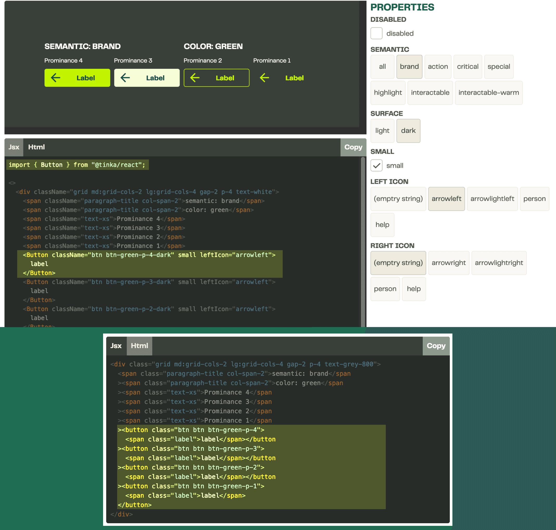
Button Playground
The developers can check how to implement a button right on our documentation with a comprehensive playground feature.
The Properties panel provides the exact same props as the component has in Figma. This enable seamless communication between design and development.
The code preview outputs the right code snippet for the developers to just copy-and-paste the code into the project. This further reduce the chance of misalignment.
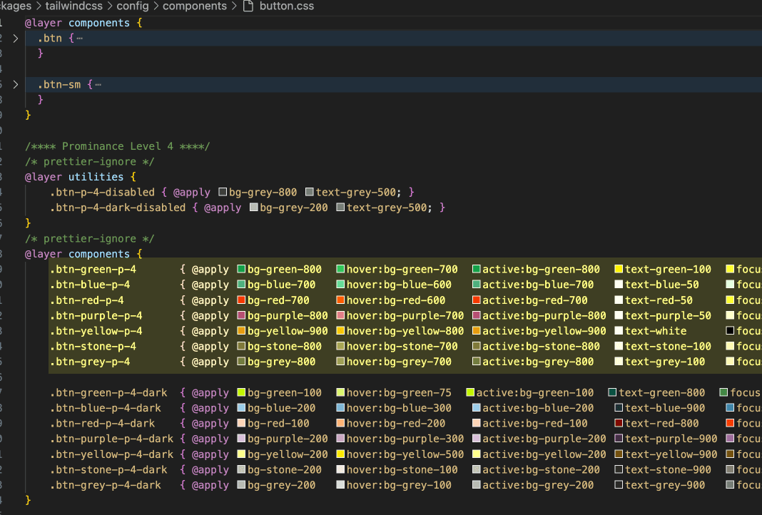
The CSS file
Instead of describing visual importance as "Primary, secondary", we adopt a Prominence system. Each color are assigned a semantic meaning, and is further expanded based on interaction like here in Button - Semantic.
The reason why we still use a bunch of Tailwind-specific syntax when we supposedly can just use vanilla CSS is to benefit from the state modifiers from Tailwind. I've tried a few different vanilla approaches like CSS Variables or just plain straight CSS, but eventually I realized with @apply the code is the easiest to author - each color token is arranged like the table structure we have in the Figma file.
It is definitely possible to continue to automate the generation of this file with some token plugins, or the new Figma CodeConnect. This is made manually primarily for the reason that we forsee that we are not going to iterate buttons frequently at the current stage.
Example: Complicated components – Input Field
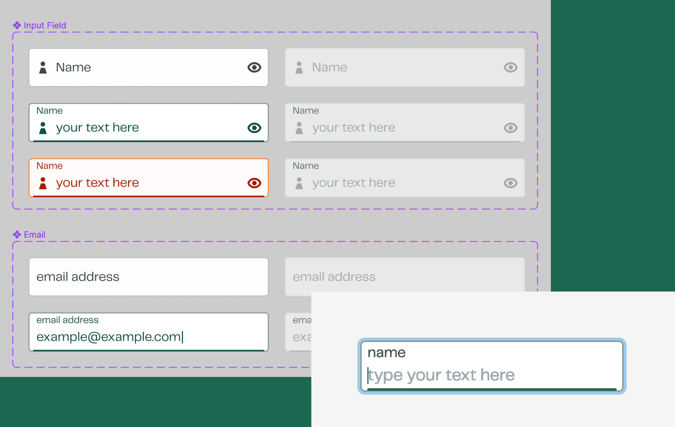
Some of the components can’t be described purely in CSS – they have some fancy internal layout that needs to be manipulated when the state changes. Input fields in our design system is one of this type of components.
How did we prepare this for each framework?
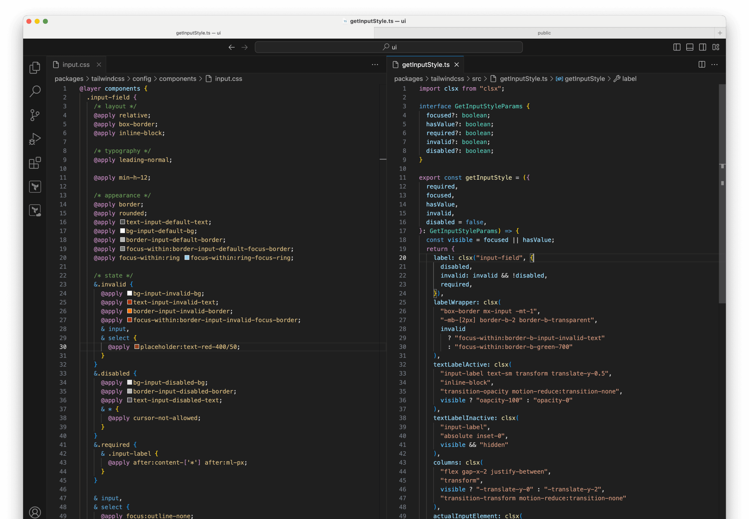
Now for this component, we implemented it for Svelte and React along with our developers in the product teams.
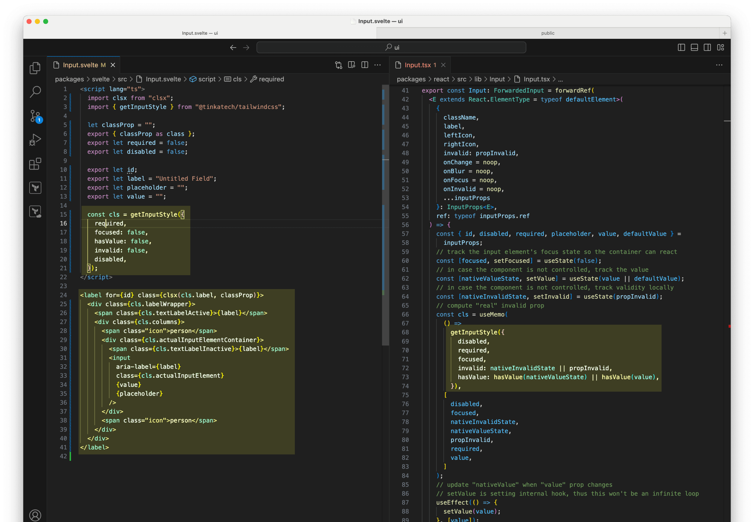
For each framework we are only writing extra framework-API-related code and duplicating the HTML structure, the appearance-controlling code are imported from the same source.
Theoretically more can be taken out from each component such as how content are formatted. We've learned that the best way to expand support to our users is to provide a basic framework-agnostic tool set like the CSS and the JS utility. As the adoption rate goes up, we might bring their component code into the core UI libraries (with permission).
Break components down into patterns

Every project will have slight differences in controlling how the floating menu will pop and position. It would be difficult for me as the design system maintainer to foresee the requirements and design an easy to use API.
For such component I decided to only implement the look in CSS, provide a style guide that guide the developers to apply the utility classes. Finally, I implemented an example in React with headless UI.
Sometimes using technology to ensure proper design implementation will cause more works for maintainers and users. Instead of treating them as an integral component with internal workings, we treat them as composable as patterns and out-source the state. Via examples and code snippets, we help the developers understand What makes a UI pattern consistent and usable.This approach perhaps could be echoed by this article I read recently – The Art of Design System Recipes.
Without Frameworks
<head>
  <link rel="stylesheet" href="https://www.tinka.nl/assets/styles/plain.css" />
</head>
For our users that is not using a setup where they can setup TailwindCSS, we've written design.tinka.tools/develop/quick-start/no-framework for them.
The plain.css file is generated by just telling Tailwind to generate a CSS file with selected utility classes. I did this with a HTML file and included it in the content array in the config.
I wrote a PostCSS plugin that prefix every selector with a .tinka parent, for a scoped stylesheet that is safer to use in other domain.
Maintaining the code
We have a monorepo that contains the code for the base Tailwind package, content formatting package, icons, react package and much more. We are using NX to manage the repo.
Validating and building the packages is where we invest more in automation. Our CI/CD and publishing is setup on GitHub with GitHub Actions and GitHub Packages.
For versioning, we use Google's Release Please. It checks for update in each package, update the package.json files, writes change log, and generate tags on Git automatically. This is saving me tons of time as a solo dev on this project.
Our Flutter-side project
Around the beginning of the second year of the project, I started to work on a Flutter UI library written in Dart. This is an area I've always wanted to check.
This is where only 20% of our framework-agnostic approach carries over to a whole new eco-system. This means every component needs to be re-written for the framework. The structures needed for each component is now different.
However, with our solid design on usage and documentation, it is pretty straightforward to implement the components. Flutter being a super well-designed framework for implementing design also accelerate our workflow. After we shipped the StyleSheet, the app team is already ready to take it in and use in production.
Last and the least, having a input field identical to the material design one definitely paid off here.
The Result
Feedbacks
We have reasonable uptake in new projects that uses React and Svelte. When I was preparing the first presentation, I realized one ancient codebase also start to use the new design system.
Our product teams are always under some time pressure, therefore they would adopt anything that can help them do their job faster. We put enormous effort on documentation and dev support in this project, which makes adopting it much easier.
Using a well-documented and flexible framework like Tailwind also helped me support such a much large area of technology. Although so far there is no Vue users in our organization, but I am certain that it won't be a time sucker for me to help them get started with solid and consistent UI design.
I've got positive feedback from the designers with the setup in Figma. Having all the possible text styles for all possible type faces without a semantic name like "Title", "Body Text" indeed has some initial learning curve. But it proves to be a preferred method where the designs are not bound to just one style for a specific title, everything can be put in relation while making sure things are consistent.
Did we manage to be framework-agnostic?
In the most conservative way, we support as many web frontend framework as Tailwind can do. So all the credit goes to that amazing open-source software.
From my designer's perspective, they are using the same library in Figma. Designing is more thinking about how the user interacts with the elements, rather than worrying about the underlying tech stack.
According to my conversation with my web developer users, they did not feel like their tech choice is limited by what the design system can offer. One thing to note is that our pick on Next.js did convince a lot of our developers to stay with React.
As for app developers, we are still catching up with actually implement the components. But having someone worry about naming, documenting, and implementing all the colors and text styles is already a big help.
Conclusion
To summarize how we built our design system to be framework-agnostic, we leverage the power of documentation and proper base-layer tooling. We have a Bring-Your-Own-State-Management approach to make sure our library API is not too stretched to fit everyone's need, and customization is always possible. We only sweat over implementing components that we absolutely do not allow customization for each and every framework, and fortunately that rarely happens.
In a constantly-pivoting FinTech company like Tinka, striving for a framework-agnostic solution is unfortunately not enough. But it is still a good decision to win the product teams over. Because of this goal, our design system is not only a useful tool for our designers, but also really accelerated our developers both in production and communication. It left a strong impression in me that how good documentation and active communication is the real driving force of making design consistent and manageable.